

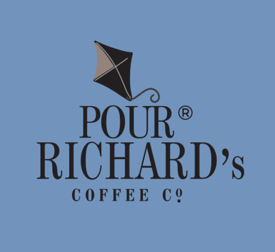
Pour Richard’s Coffee Company Rebrand
Pour Richard’s Coffee Company needed a rebrand that was capable of achieving brand recognition prior to the rollout of a new bottled product that was going to be sold in grocery store chains along the East Coast. I created an updated logo for the coffee company while maintaining the imagery the owners felt was crucial for their brand. A Philadelphia based company, they wanted to incorporate both a kite and a key in their logo to pay homage to Benjamin Franklin. In their original logos these symbols varied between the materials they were used on, sometimes omitting one of the symbols altogether. I wanted to create a logo with a consistent utilization of both symbols that was clean and modern. As secondary imagery, I used a lightning bolt to bring all of the symbols together in representing Benjamin Franklin’s discovery of electricity.
BEFORE
Pour Richard’s used 4+ logo variations across their brand materials, making it difficult to achieve the brand recognition they wanted.


AFTER
In addition to designing the company’s new logo, I was also responsible for the design of various brand materials including coffee bags, mugs and giftcards.


